Polaris Digital
My Role
Senior Product Designer
Tools
Figma, User Testing, Jira
Team
PMs, Engineers, UX
Timeline
Q1 - Q2 2022
Polaris builds high-performance vehicles trusted for durability and power on trails, job sites, and beyond. I contributed to the redesign of its fitment and discovery flow—delivering mobile-first wireframes, refined navigation, and high-fidelity UI with cross-functional teams.
What is Prolink?
A smarter way to order parts and manage inventory

A B2B auto shop platform delivering complete solutions for professionals, including inventory management, shop training, service facility support, technician tools, reordering, and more.
Iterations
To move quickly without starting from scratch, we built on the existing site foundation—minimizing risk while layering in impactful updates. This let us focus on refining what mattered most, not overhauling the entire experience.
We ran iterative tests with 10 vetted users across riding levels and use cases—from recreational to business. All were interested in purchasing an ATV or leisure vehicle. Their feedback guided key improvements to the hero header, layout, and filters, creating a more intuitive, visually engaging experience for Polaris’ diverse audience.
Final Results & Impact
User-Centered Clarity
Following the launch of the new solutions, customers reported a significant increase in their ability to learn about products specifically tailored to meet their individual needs.
This clarity enhanced the user experience and boosted engagement, empowering users to make more informed, personalized decisions with confidence.
+42%
Rise in learning tool engagement
Higher engagement shows users want faster, deeper ways to explore and learn about products.
-27%
Reduced drop-off during product exploration
Fewer users abandoned the journey mid-search, showing improved clarity and engagement during product exploration.
+38%
Increase in vehicle selection confidence
The increase reflects growing user trust, creating opportunities to simplify guidance and drive deeper engagement.
What I Learned
The digital revamp showed me that great design depends just as much on clear communication and cross-team collaboration. Staying aligned with stakeholders and developers helped us move faster and make smarter decisions.
It also reinforced the value of iteration—testing early, staying open to feedback, and refining with the user in mind. That rhythm of listening and adjusting made the final product stronger at every step.
Solution
We transformed product exploration into a faster, smarter, and more immersive experience—meeting users where they are, and guiding them confidently to where they want to go.
We wanted the Polaris experience to feel easy and inspiring, so we focused on strong visuals, simple tools, and a cleaner search. From action shots to quick, helpful content, every part of the site was built to help riders explore and decide without feeling overwhelmed.
Research
Before designing, I needed a clear view of Polaris Digital’s audience. Through interviews, surveys, and behavioral data, we uncovered a wide spectrum of users—from curious first-time riders to seasoned pros in construction, agriculture, and outdoor recreation, each with different needs, confidence levels, and discovery goals.
Key Insights:
Beginners were overwhelmed by terminology and layout.
Experts wanted speed and minimal steps.
All users needed clearer compatibility cues.
Problem
As Polaris’ audience expanded to include both seasoned riders and newcomers, the platform’s limits became clear. Vehicle compatibility was confusing, CTAs were easy to miss, and the path to the right product often felt unclear—turning what should’ve been a confident journey into hesitation.
Polaris needed to simplify a complex experience and guide all riders to the right choice with confidence — while keeping the journey immersive, consistent, and deep across devices.
Problem
The platform had been reliable for years, but it hadn’t kept up. Shops were juggling clunky tools and outdated workflows that slowed them down. Whether they were big operations or small teams, users needed something faster, clearer, and more responsive across devices.
The challenge: Modernize the platform to attract new users, retain existing ones, and differentiate in a competitive market through a stronger, user-centered experience.
Research
Before designing, I needed a clear view of Polaris Digital’s audience. Through interviews, surveys, and behavioral data, we uncovered a wide spectrum of users—from curious first-time riders to seasoned pros in construction, agriculture, and outdoor recreation, each with different needs, confidence levels, and discovery goals.
Key Insights
Beginners were overwhelmed by terminology and layout.
Experts wanted speed and minimal steps.
All users needed clearer compatibility cues.
Kayla is a new rider seeking a simple, reliable ATV without extra features — just easy, confident riding.
17%

Kayla's Story
Skill level: Novice
Novice User
Age: 26
Occupation: Software Engineer
The Recreational Rider
Kayla is a new rider seeking a simple, reliable ATV without extra features — just easy, confident riding.
17%
Kayla's Story
Skill level: Novice
Novice User
Age: 26
Occupation: Software Engineer
The Recreational Rider
Kayla is a new rider seeking a simple, reliable ATV without extra features — just easy, confident riding.
17%
Kayla's Story
Skill level: Novice
Novice User
Age: 26
Occupation: Software Engineer
The Recreational Rider
Joe is a work-first rider who needs a durable, reliable, and powerful ATV to handle tough tasks—yet versatile enough for the occasional leisure ride.

Joe's Story
Age: 52
Occupation: Farmer
87%
Joe's Story
Skill level: Intermediate
Work-driven Enthusiast
Joe is a work-first rider who needs a durable, reliable, and powerful ATV to handle tough tasks—yet versatile enough for the occasional leisure ride.
Joe's Story
Age: 52
Occupation: Farmer
87%
Joe's Story
Skill level: Intermediate
Work-driven Enthusiast
Joe is a work-first rider who needs a durable, reliable, and powerful ATV to handle tough tasks—yet versatile enough for the occasional leisure ride.
Joe's Story
Age: 52
Occupation: Farmer
87%
Joe's Story
Skill level: Intermediate
Work-driven Enthusiast
A rural police force depends on durable ATVs to reach remote areas, handle rescues, and navigate tough terrain efficiently.


The ASPD's Story
Expert User(s)
Fictional Police Dept.
96%
Work-only Essential
The ASPD's Story
Skill level: Expert
A rural police force depends on durable ATVs to reach remote areas, handle rescues, and navigate tough terrain efficiently.
The ASPD's Story
Expert User(s)
Fictional Police Dept.
96%
Work-only Essential
The ASPD's Story
Skill level: Expert
A rural police force depends on durable ATVs to reach remote areas, handle rescues, and navigate tough terrain efficiently.
The ASPD's Story
Expert User(s)
Fictional Police Dept.
96%
Work-only Essential
The ASPD's Story
Skill level: Expert
Iterations
To move quickly without starting from scratch, we built on the existing site foundation—minimizing risk while layering in impactful updates. This let us focus on refining what mattered most, not overhauling the entire experience.
We ran iterative tests with 10 vetted users across riding levels and use cases—from recreational to business. All were interested in purchasing an ATV or leisure vehicle. Their feedback guided key improvements to the hero header, layout, and filters, creating a more intuitive, visually engaging experience for Polaris’ diverse audience.
Synthesis #1
Improving First Impressions with Visuals
View Iterations
Synthesis #2
Simplified Browsing by Category
View Iterations

Synthesis # 3
Tabbed info and interactive 3D vehicle views
View Iterations


The era of spatial computing is here.
Learn more
Buy now

Solution
We wanted the Polaris experience to feel easy and inspiring, so we focused on strong visuals, simple tools, and a cleaner search. From action shots to quick, helpful content, every part of the site was built to help riders explore and decide without feeling overwhelmed.
We transformed product exploration into a faster, smarter, and more immersive experience—meeting users where they are, and guiding them confidently to where they want to go.


Striking First Look
Vehicle Guides
Articles for Every Rider
Watch & Learn
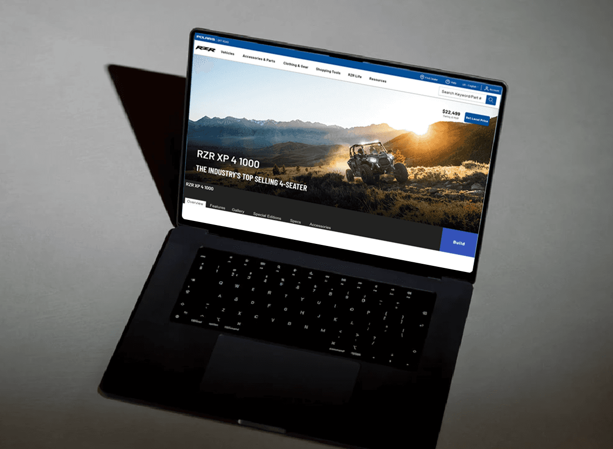
The reimagined hero featured a bold action shot and visual-first layout to spark interest. Key info—name, tagline, and price—was placed below in a clean, user-informed format.
Striking First Look
Vehicle Guides
Articles for Every Rider
Watch & Learn
The reimagined hero featured a bold action shot and visual-first layout to spark interest. Key info—name, tagline, and price—was placed below in a clean, user-informed format.


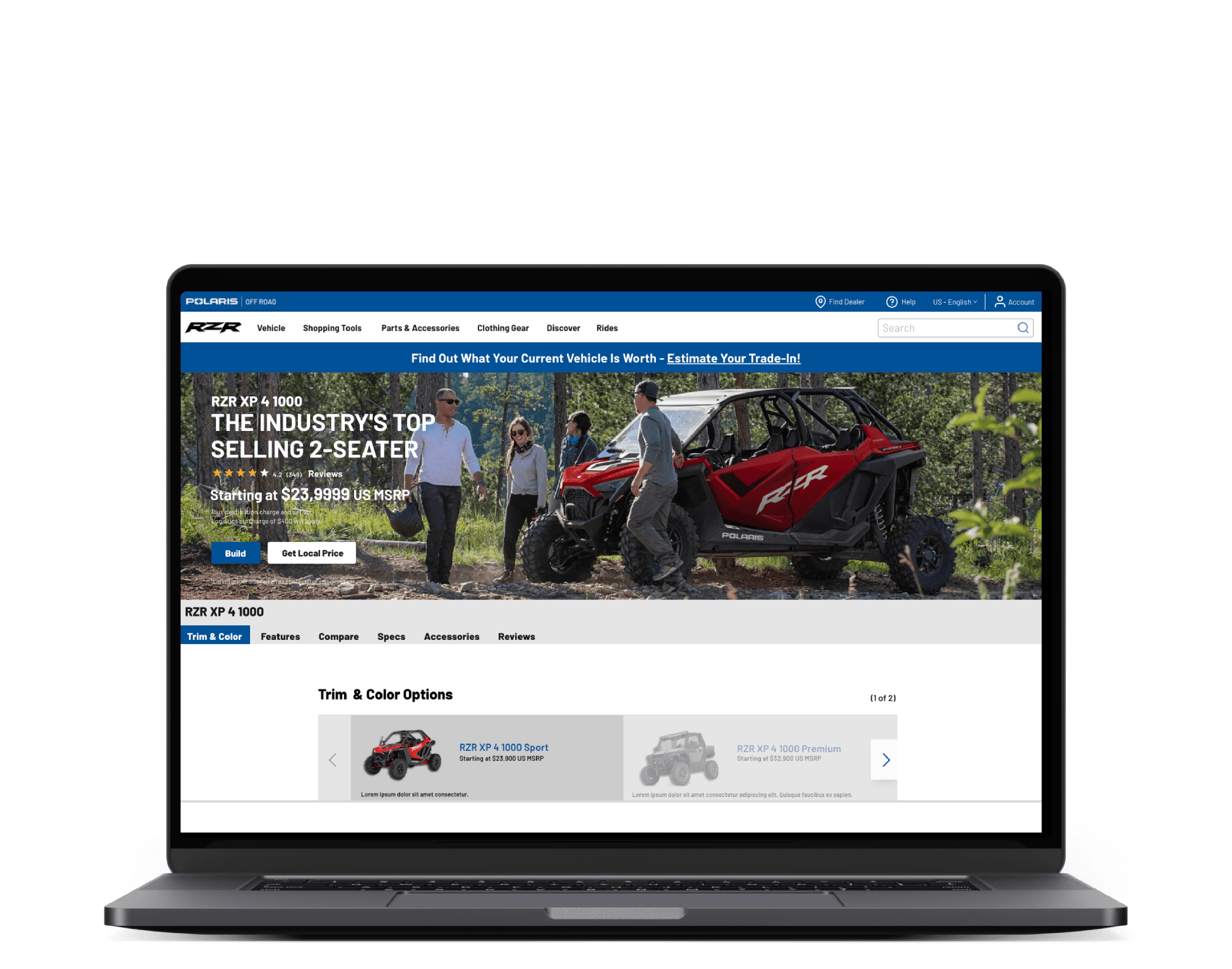
Interactive Showcase
Interactive Showcase
The interactive module lets users explore vehicles from all angles and instantly scan key specs—guiding both beginners and experts with ease.
The interactive module lets users explore vehicles from all angles and instantly scan key specs—guiding both beginners and experts with ease.
Key Benefits for Users
Key Benefits for Users
Key features were prioritized to cut through complexity, support faster decisions, and deliver a clearer, more confident user experience.
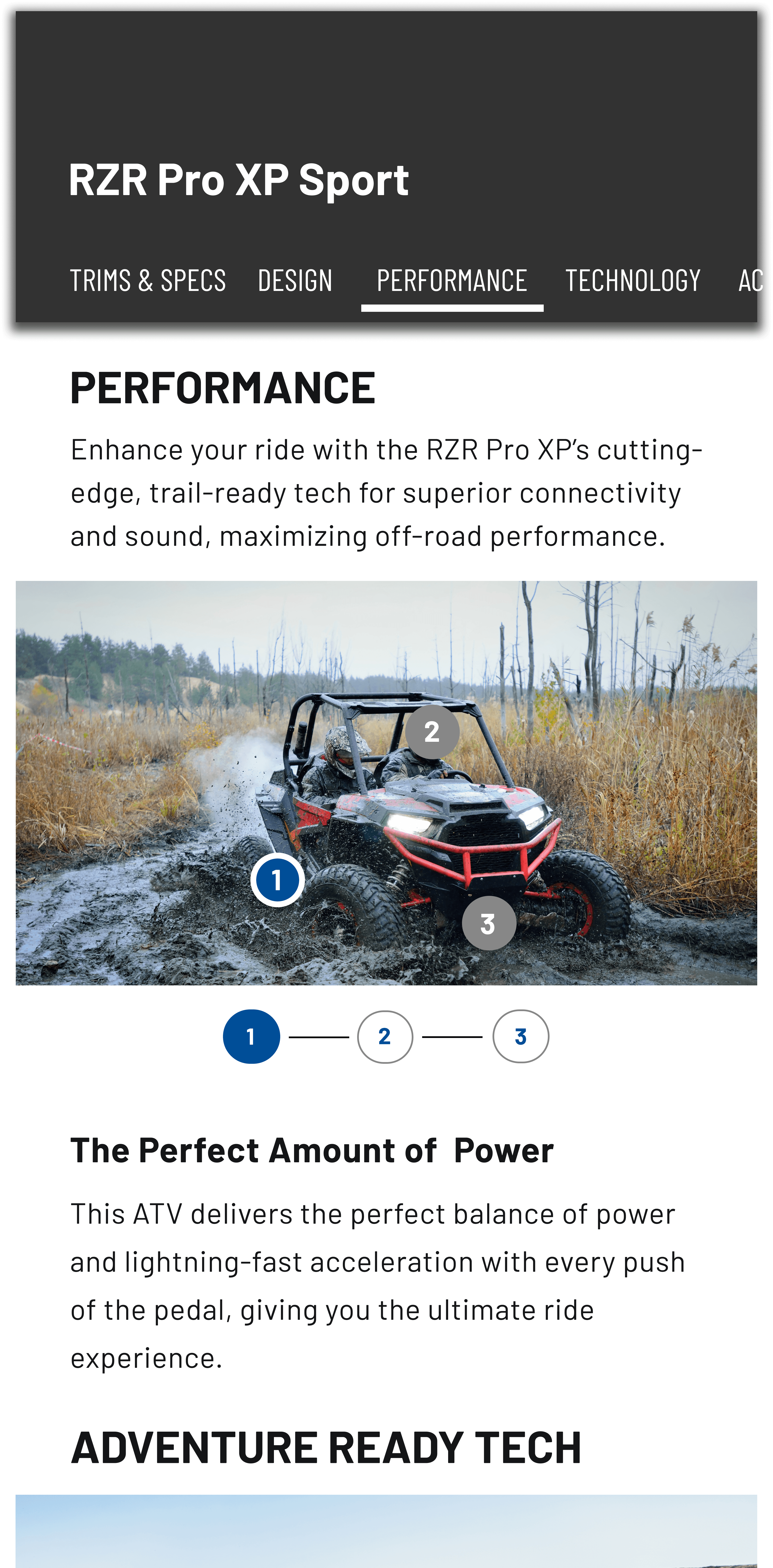
Find Your Path—Browse by Category
To make the experience more approachable, we introduced concise articles and simple filters—giving beginners a clear starting point and helping seasoned users find what they need faster, with less friction.
To make the experience more approachable, we introduced concise articles and simple filters—giving beginners a clear starting point and helping seasoned users find what they need faster, with less friction.

Sort by type and use
Redesigning the article section with concise content and easy filters made the experience more approachable and focused. It eased overload, gave beginners a clear start, and helped experts find answers faster—directly addressing the key challenges users shared.
Redesigning the article section with concise content and easy filters made the experience more approachable and focused. It eased overload, gave beginners a clear start, and helped experts find answers faster—directly addressing the key challenges users shared.
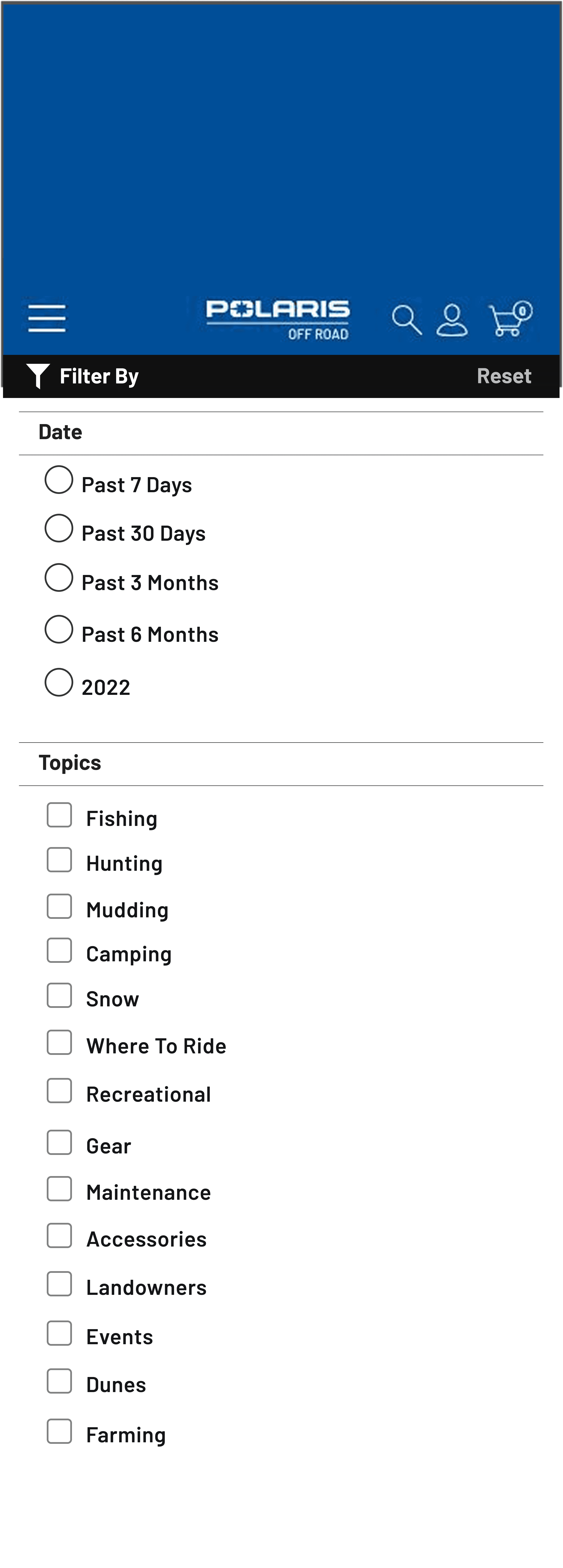
Filtered Vehicle Search
A streamlined filtering system made it easier to narrow down ATVs by performance, terrain, and features—reducing overwhelm, guiding beginners, and giving experts quicker, more personalized access to what mattered most.
A streamlined filtering system made it easier to narrow down ATVs by performance, terrain, and features—reducing overwhelm, guiding beginners, and giving experts quicker, more personalized access to what mattered most.

Final Results & Impact
User-Centered Clarity
Following the launch of the new solutions, customers reported a significant increase in their ability to learn about products specifically tailored to meet their individual needs.
This clarity enhanced the user experience and boosted engagement, empowering users to make more informed, personalized decisions with confidence.
+38%
Increase in vehicle selection confidence
The increase reflects growing user trust, creating opportunities to simplify guidance and drive deeper engagement.
+42%
Rise in learning tool engagement
Higher engagement shows users want faster, deeper ways to explore and learn about products.
-27%
Reduced drop-off during product exploration
Fewer users abandoned the journey mid-search, showing improved clarity and engagement during product exploration.
What Stood Out
Prolink lagged behind in speed, navigation, and overall UX
We spoke with over 20 users in the automotive parts industry to uncover pain points in the current workflow and gain deeper insight into what drew them to competing platforms. These conversations helped us understand not just how users navigated Prolink, but why they often preferred the experience elsewhere.
Key Gaps & Competitive Offerings
Simplified Search Experience Across Competitors
Competitors: All three competitor sites allow users to find parts quickly with fewer steps, creating a more intuitive and efficient experience.
Prolink: Users reported that the vehicle search process felt long and cumbersome, lacking time-saving features like saved searches or recent lookups.
Faster Lookups with Saved Vehicles
Competitors: A vehicle sorter enables users to save past searches and access them instantly, speeding up the parts-buying process.
Prolink: Prolink does not support saved vehicle lookups, forcing users to re-enter information repeatedly — slowing down conversions and increasing friction.
Expanded Catalogs and Training Resources
Competitors: Offer access to current and past parts catalogs, along with robust training materials to support repair technicians and shop owners.
Prolink: While Prolink offers catalog information, users found the interface less intuitive and desired deeper, more organized training support.
What I Learned
The digital revamp showed me that great design depends just as much on clear communication and cross-team collaboration. Staying aligned with stakeholders and developers helped us move faster and make smarter decisions.
It also reinforced the value of iteration—testing early, staying open to feedback, and refining with the user in mind. That rhythm of listening and adjusting made the final product stronger at every step.
Synthesis #1
Improving First Impressions with Visuals
View Iterations
Synthesis #2
Simplified Browsing by Category
View Iterations
Synthesis # 3
Tabbed info and interactive 3D vehicle views
View Iterations
The era of spatial computing is here.
Learn more
Buy now
Synthesis #1
Improving First Impressions with Visuals
View Iterations
Synthesis #2
Simplified Browsing by Category
View Iterations
Synthesis # 3
Tabbed info and interactive 3D vehicle views
View Iterations
The era of spatial computing is here.
Learn more
Buy now
Problem
As Polaris’ audience expanded to include both seasoned riders and newcomers, the platform’s limits became clear. Vehicle compatibility was confusing, CTAs were easy to miss, and the path to the right product often felt unclear—turning what should’ve been a confident journey into hesitation.
Polaris needed to simplify a complex experience and guide all riders to the right choice with confidence — while keeping the journey immersive, consistent, and deep across devices.
Problem
The platform had been reliable for years, but it hadn’t kept up. Shops were juggling clunky tools and outdated workflows that slowed them down. Whether they were big operations or small teams, users needed something faster, clearer, and more responsive across devices.
The challenge: Modernize the platform to attract new users, retain existing ones, and differentiate in a competitive market through a stronger, user-centered experience.
What Stood Out
Prolink lagged behind in speed, navigation, and overall UX
We spoke with over 20 users in the automotive parts industry to uncover pain points in the current workflow and gain deeper insight into what drew them to competing platforms. These conversations helped us understand not just how users navigated Prolink, but why they often preferred the experience elsewhere.
Key Gaps & Competitive Offerings
Simplified Search Experience Across Competitors
Competitors: All three competitor sites allow users to find parts quickly with fewer steps, creating a more intuitive and efficient experience.
Prolink: Users reported that the vehicle search process felt long and cumbersome, lacking time-saving features like saved searches or recent lookups.
Faster Lookups with Saved Vehicles
Competitors: A vehicle sorter enables users to save past searches and access them instantly, speeding up the parts-buying process.
Prolink: Prolink does not support saved vehicle lookups, forcing users to re-enter information repeatedly — slowing down conversions and increasing friction.
Expanded Catalogs and Training Resources
Competitors: Offer access to current and past parts catalogs, along with robust training materials to support repair technicians and shop owners.
Prolink: While Prolink offers catalog information, users found the interface less intuitive and desired deeper, more organized training support.
A B2B auto shop platform delivering complete solutions for professionals, including inventory management, shop training, service facility support, technician tools, reordering, and more.
Iterations
To move quickly without starting from scratch, we built on the existing site foundation—minimizing risk while layering in impactful updates. This let us focus on refining what mattered most, not overhauling the entire experience.
We ran iterative tests with 10 vetted users across riding levels and use cases—from recreational to business. All were interested in purchasing an ATV or leisure vehicle. Their feedback guided key improvements to the hero header, layout, and filters, creating a more intuitive, visually engaging experience for Polaris’ diverse audience.
What I Learned
The digital revamp showed me that great design depends just as much on clear communication and cross-team collaboration. Staying aligned with stakeholders and developers helped us move faster and make smarter decisions.
It also reinforced the value of iteration—testing early, staying open to feedback, and refining with the user in mind. That rhythm of listening and adjusting made the final product stronger at every step.
Solution
We transformed product exploration into a faster, smarter, and more immersive experience—meeting users where they are, and guiding them confidently to where they want to go.
We wanted the Polaris experience to feel easy and inspiring, so we focused on strong visuals, simple tools, and a cleaner search. From action shots to quick, helpful content, every part of the site was built to help riders explore and decide without feeling overwhelmed.
Final Results & Impact
User-Centered Clarity
We transformed product exploration into a faster, smarter, and more immersive experience—meeting users where they are, and guiding them confidently to where they want to go.
We wanted the Polaris experience to feel easy and inspiring, so we focused on strong visuals, simple tools, and a cleaner search. From action shots to quick, helpful content, every part of the site was built to help riders explore and decide without feeling overwhelmed.
-27%
Reduced drop-off during product exploration
Higher engagement shows users want faster, deeper ways to explore and learn about products.
+42%
Rise in learning tool engagement
Higher engagement shows users want faster, deeper ways to explore and learn about products.
+38%
Increase in vehicle selection confidence
The increase reflects growing user trust, creating opportunities to simplify guidance and drive deeper engagement.
Synthesis #1
Improving First Impressions with Visuals
View Iterations
Synthesis #2
Simplified Browsing by Category
View Iterations
Synthesis # 3
Tabbed info and interactive 3D vehicle views
View Iterations
The era of spatial computing is here.
Learn more
Buy now
Synthesis #1
Improving First Impressions with Visuals
View Iterations
Synthesis #2
Simplified Browsing by Category
View Iterations
Synthesis # 3
Tabbed info and interactive 3D vehicle views
View Iterations
The era of spatial computing is here.
Learn more
Buy now
Find Your Path—Browse by Category
We added concise articles and simple filters to give beginners a clear entry point and help experienced users find what they need faster.
Filtered Vehicle Search
Streamlined filters simplified ATV searches by performance, terrain, and features—reducing overwhelm, guiding beginners, and helping experts find what matters faster.
Sort by type and use
Concise content and easy filters made the article section more approachable—easing overload, guiding beginners, and helping experts find answers faster.
Striking First Look
Vehicle Guides
Articles for Every Rider
Watch & Learn
The reimagined hero featured a bold action shot and visual-first layout to spark interest. Key info—name, tagline, and price—was placed below in a clean, user-informed format.
Striking First Look
Vehicle Guides
Articles for Every Rider
Watch & Learn
The reimagined hero featured a bold action shot and visual-first layout to spark interest. Key info—name, tagline, and price—was placed below in a clean, user-informed format.
The interactive module lets users explore vehicles from all angles and instantly scan key specs—guiding both beginners and experts with ease.
Interactive Showcase
Key Benefits for Users
Key features were prioritized to cut through complexity, support faster decisions, and deliver a clearer, more confident user experience.
Research
Before designing, I needed a clear view of Polaris Digital’s audience. Through interviews, surveys, and behavioral data, we uncovered a wide spectrum of users—from curious first-time riders to seasoned pros in construction, agriculture, and outdoor recreation, each with different needs, confidence levels, and discovery goals.
Beginners were overwhelmed by terminology and layout.
Experts wanted speed and minimal steps.
All users needed clearer compatibility cues.
Key Insights:
